INTERESTED IN FOOD PHOTOGRAPHY? CHECK OUT SOME OF THE ESSENTIAL PHOTOGRAPHY GEAR WE USE TO CREATE OUR PHOTOS! THESE HOMEMADE TORTILLAS WERE SHOT USING CANON’S EF 24-70mm f/2.8L USM Zoom Lens, SEE WHAT WE HAVE TO SAY ABOUT IT. READ OUR REVIEWS
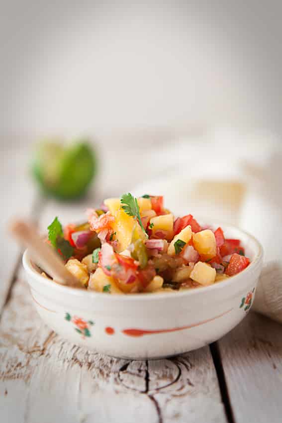
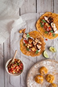
Mexican food is always a winner at our home and this dish is a favorite of mine. I love seafood, Heather not so much, but with this recipe you can easily swap the salmon with some spicy chicken or carne asada. The key winner here is the homemade jalapeño tortillas and Mango Salsa! When we have friends over the standard request is Mexican food and we’re always trying to come up with new ways to please. You can find the recipe below the photos.A Little About Composing Food Photography
Although, I would like to go as in-depth as I’m about to with every photo we take, I think at some point you would find my ranting a bit repetitive and boring. So I’ll sprinkle future posts with bits of details, tips and whatnots, but try to keep it simpler, more inline with the creative thinking process. I thought the picture in this post, though would be a good place to lay it all out on the table so to speak, especially about composing food photography. So here we go…
THE INSPIRATION
For the project side of things, I knew I wanted to create a diptych. One shot would be overhead showing the main recipe and ingredients. The other photo would be a supplementary photo of the main shot, highlighting the mango salsa.
I love photographing food from above, I think Heather and I were both graphic designers in another life, the whole scene takes on a new life form when viewed from this angle and composing food photography becomes a lot easier. It’s almost as if the purpose of the shot turns from showing the viewer how delicious the food is to letting the viewer sink into the design relationships between the shapes, curves and lines of the food and props within the frame. You can really get a sense of this when looking at work from food photographers like Christina Holmes and Ditte Isager, their work is a great inspiration all around!
THE LIGHTING
The lighting is simple. A large sliding glass door in our home studio at a time when the sun was not directly shining through. We softened it a little with some diffusion paper, which you can find at your local photography store or strangely enough musical instrument shop (if they sell stage lighting gels and diffusors). We usually use some white or black cards but in this case the food laid flat on the table and there were not much shadows to speak of. You can see an example of the set up in our post about the FujiFilm X-E1 vs the Canon 5Dmk2 & 7D.
THE IDEA
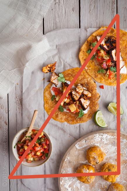
In this section I’m going to focus on the overhead shot. When composing food photography, it’s often great to leave a little room for copy, what the industry calls the text portion of an advertisement. I was going to place the recipe there so we left it rather blank. I’m obsessed with pre-visualizing how my viewers eyes will move across the photo. I very much want to keep that in mind when styling or composing food photography. For this shot I imagined that the copy would be placed on the top left-hand corner, going about a third of the way down the frame. I decided that using the food, I would move the viewers eyes from the last word of the copy to the bottom of the frame using two diagonal lines. These lines would form a triangle nested on the right side of the frame and hopefully lock the viewers eyes in a continuous loop. Locking the viewers eyes within the frame is what most photographers are striving to achieve as it keeps the viewer looking at their photo.
THE STYLE
The style of the props has a lot to do with composing food photography as what we chose had everything to do with the shape of the food. I wanted the props to mimic the shapes of the tortillas, so it was circles all around. I chose a dough rolling board that was circular and a small circular bowl for the salsa. Next up in the creative thinking process was color.
Photography theory states that the viewers eye will look firstly at the brightest spot in the photo, then secondly search for what is in focus. So the subject “in theory” should be the brightest most in focus item in the frame.
This theory is exceptionally important when composing food photography and when choosing props to style a photograph. So with that in mind, I went for props that were muted in color and for the majority all the same tone. I really wanted the viewers eyes to move directly to the food! I decided to go with shades of white rather than darker colors because for me mexican food is very colorful and bright. I also wanted to style the food and props in a very truthful way like a home cook would do rather than neat and sterile like a five star chef.
TIPS:
- Can’t find a cool wooden table like you see in a lot of other peoples work, then make one out of old pallets. Separate the beams from the base then push them back tightly together and re-nail it. You then can then sand and paint or stain it any color you want! Make a few and save them for future shoots.
- Search for bowls which are shallow, you never want your food to look like it’s swimming in a large bowl.


